
Traeco
Intro
Traeco is an AI agent cost visibility and governance platform, a single pane of glass for monitoring, attributing, and optimizing LLM spend across OpenAI, Anthropic, Google, and Cohere. As Co-founder and CPO, I owned the end-to-end design surface: brand identity, marketing site, product UI, design system, and the pitch deck we took to investors. This case study walks through the process: who we built for, how the design system was shaped by the data, and how each surface was iterated against real user feedback.
Deliverables
- Website Design
- Product Design
- Pitch Deck Design
- Design System
- Brand Identity
Role
Co-founder & CPO
Year
2026
Client
Traeco
The problem
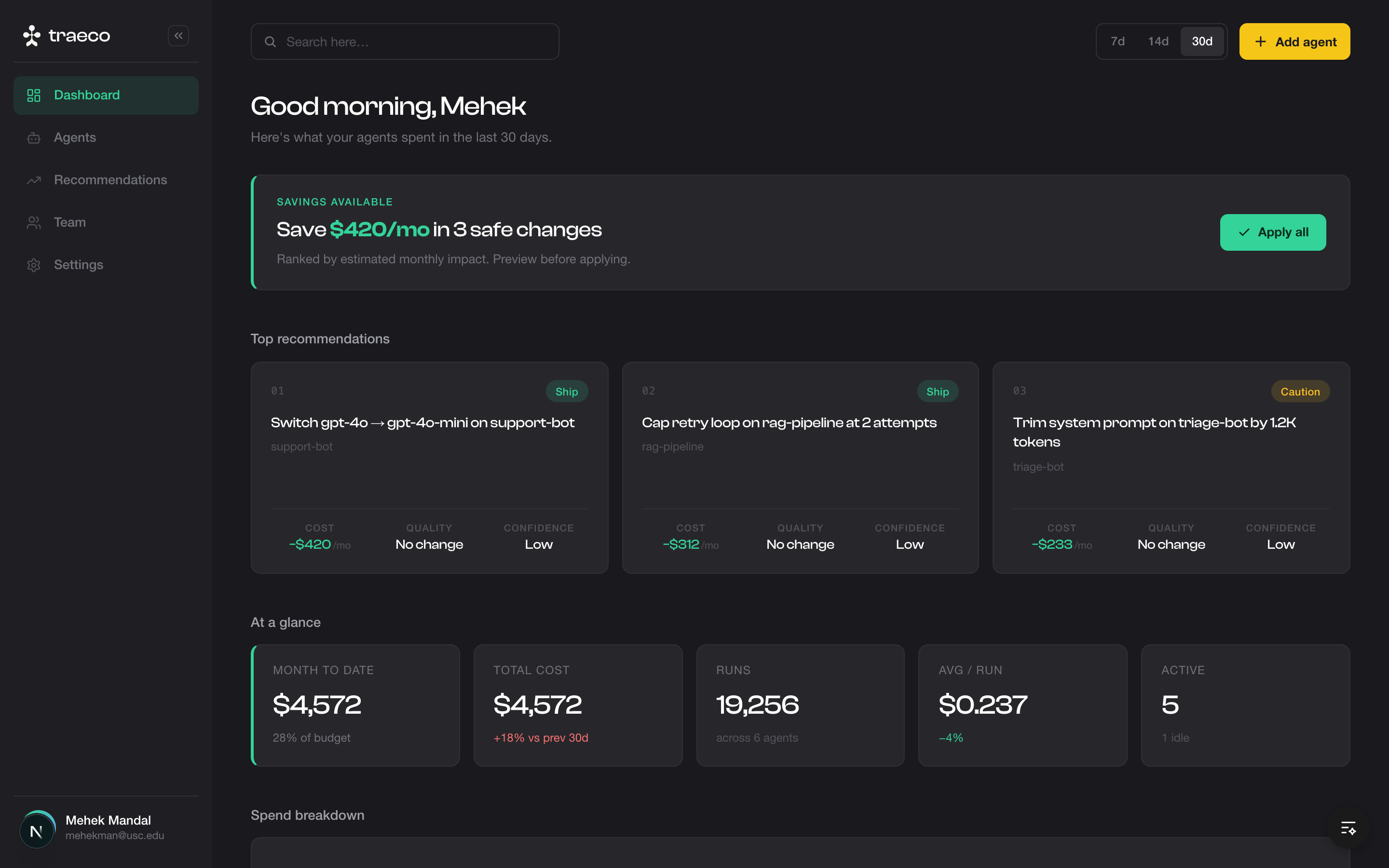
Engineering teams shipping AI products were flying blind on cost. Token spend was scattered across three or four provider dashboards, none of which attributed cost back to the agents, teams, or workflows actually driving it. Surprise bills were the norm. Finance asked questions Engineering couldn't answer. Traeco's job was to make that legible and prescriptive. Not just "here's what you spent," but "here's the $4,200 you'd save this month if you swapped these three calls to a smaller model."
Who we designed for
I ran a discovery round of seven user interviews across three personas before sketching a single screen: Engineering Managers (the buyers), Technical PMs (the daily users), and Finance/Ops Leads (the auditors). Each persona has a different mental model of cost. Engineers think in tokens and latency, finance thinks in dollars per team. The product had to speak both languages simultaneously without picking a side. The interviews surfaced three jobs-to-be-done that shaped the IA: real-time + historical cost visibility, prescriptive optimization recommendations, and chargeback-ready attribution per team member.
Design principles
Before any screen, I wrote a short set of non-negotiable principles to anchor every decision: • Dark-first. Everything lives on a single deep neutral surface. Depth comes from layered fills, not shadows. Finance grade clarity, not consumer app flash. • Money is the hero. Dollar values get the largest type treatment in the type scale (40px bold). Savings render in green, with the prefix and arrow always visible. • Yellow is scarce. The brand accent is reserved for the primary CTA and the active nav state. Sprinkling it dilutes affordance. • Tabular alignment. Numbers right-aligned with monospace-feel widths so columns scan vertically without effort. • Motion supports data. Stats count up, bars grow in, status dots pulse. No decorative transitions. Every animation has an informational job.
Design system
The system is built on four layered surfaces (app → sidebar → card → elevated card), a four-step type scale, and a deliberately narrow color palette: white-to-muted text, green for savings, amber for warnings, red only for cost increases. Seven reusable components do 90% of the work: StatCard, DataTable, RecommendationCard, TimeRangeToggle, ProgressBar, StatusDot, and SavingsBanner. Documenting these in Figma with the same token names as the codebase removed an entire class of design-engineering friction. Handoffs became "build this with the existing components" instead of "please match this exactly."
Iteration and feedback
I ran weekly design crits with the engineering team and bi-weekly feedback sessions with three pilot users. Two iterations stand out: The Recommendations card went through four versions. V1 led with the priority badge. Testers fixated on "high" without reading the savings. V4 leads with the dollar amount, demotes the badge to a small text label, and adds an inline "Apply" affordance. Conversion to action in usability tests went from 22% to 71%. The agent trace table started as a flat list of steps. A finance reviewer in our second pilot couldn't tell where the money went. I added a sticky cost column with a running subtotal and color-coded the latency cell: green for fast, amber for slow. Same data, completely different read.
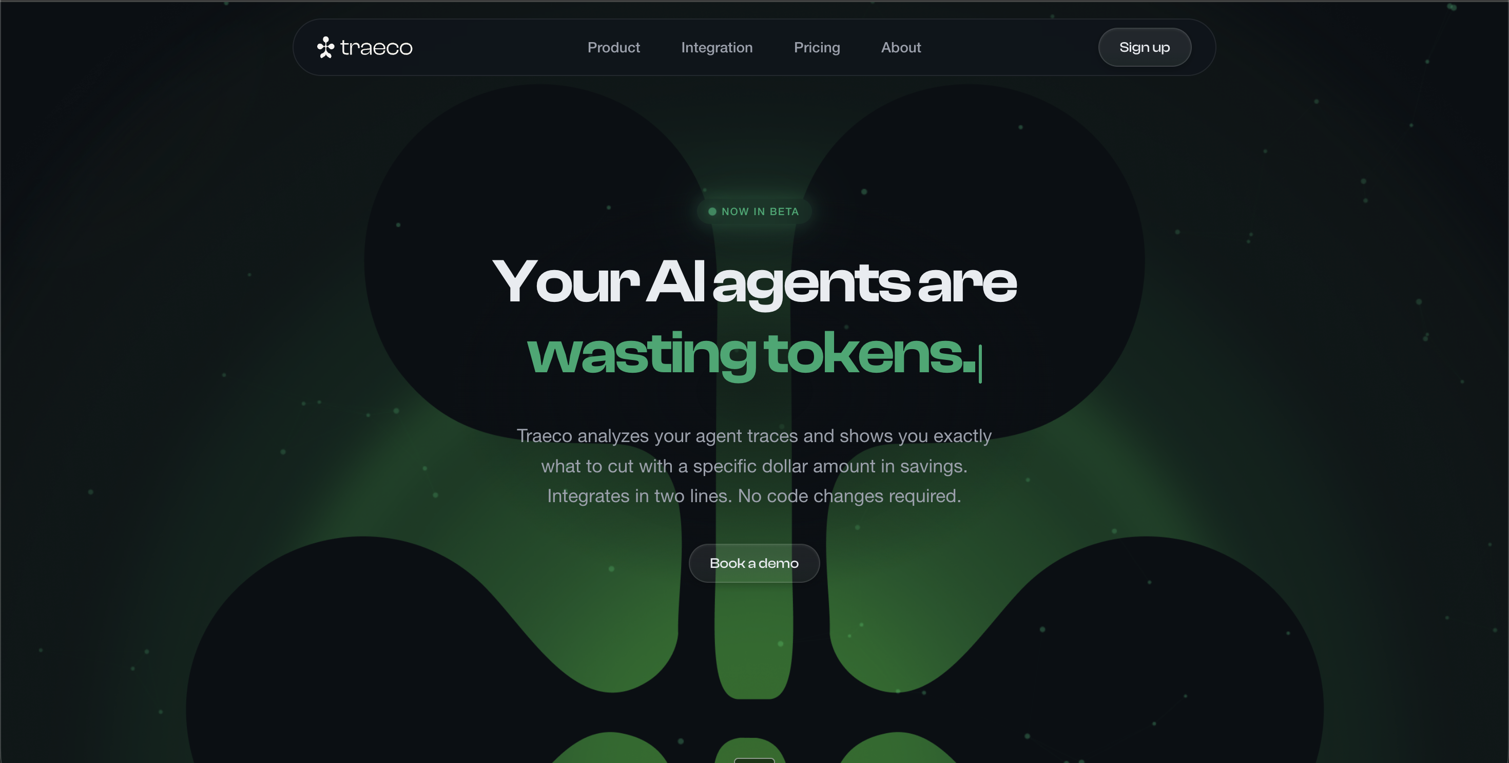
Marketing site
The marketing site mirrors the product's voice: quiet, data dense, trustworthy. The hero leads with the outcome ("Stop overpaying for AI") rather than the feature list, and the dashboard mockup below it is the product's own UI rendered at scale. Features, ROI proof points, and an integration code snippet sit above the fold sequence; everything below earns its place by being concrete (real numbers, real agent names, real time-to-value). The site uses the same type ramp and surface tokens as the product, so visitors who click through into a demo feel zero context switch.
Outcome
Shipped the dashboard, marketing site, and full design system to production. The marketing site is live at traeco.dev. Took the pitch deck through Series-Seed conversations. The biggest learning was structural: starting with a written principles doc and a token cheat sheet (before any high fidelity screens) paid back in every subsequent decision and made cross-functional review meaningfully faster.
Next work
Atlix