
Atlix
Intro
I co-founded Atlix to make sense of what young Californians are actually talking about. Atlix is a narrative intelligence dashboard that pulls public discourse from across regions and surfaces what's gaining traction, what's losing it, and how people are framing the issues that affect them. I led design across product, brand, pitch deck, and design system. This case study walks through the research, the design choices, and what I learned along the way.
Deliverables
- Product Design
- Pitch Deck Design
- Design System
- Brand Identity
Role
Co-founder
Year
2026
Client
Atlix
Where the idea came from
Polling and survey data lag behind. By the time a report goes out, the conversation has already shifted. I wanted to build something that listened to what young people were actually saying in real time, across the regions of California that don't always get the loudest mic. The product had to be useful for advocacy groups, policy researchers, and anyone who needs to read demographic discourse without waiting for a quarterly report.
Early research and interviews
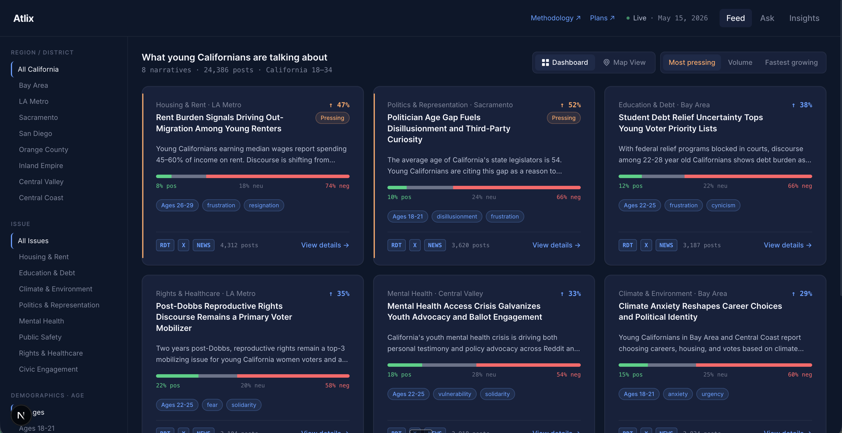
Before designing screens, I spent a few weeks reading the kinds of reports people in this space already work from, talking to researchers and advocacy folks I had access to, and trying to map out what their day actually looks like. The biggest pattern I noticed was that nobody wanted yet another data tool. They wanted summaries they could trust, with the source still one click away. That shaped the whole product: cards first, summaries upfront, citations always visible.
Designing the dashboard
The first version of the dashboard was much busier. Filters everywhere, charts on charts, every card trying to say too much at once. After getting feedback from the researchers I'd talked to earlier, I cut it back to what actually matters in the first three seconds: what's the topic, where is it happening, how much is it growing, and who's talking about it. Everything else moved into the detail view. The current layout uses left rail filters for region and issue, a tab row for sort order (most pressing, volume, fastest growing), and a card grid where each card commits to a single narrative.
The pitch deck
The deck went through a lot of versions. Early drafts overexplained the technical side and underexplained the why. The version that landed leads with the gap between when people are talking and when researchers find out about it, then shows what the dashboard does in a few screenshots. I tried to keep slide density low: one idea per slide, one image, very few words.
Brand
Atlix sits in a category where most tools look either academic and beige or aggressively tech. I wanted a third option. The brand is dark navy with a single accent, type forward, and quiet. The wordmark is a clean sans-serif because the product itself should be the loudest thing in any deck or screenshot.
Outcome
The dashboard and pitch deck took us to the global finalist round of the Asian Leadership Conference, beating out hundreds of teams from Stanford, Harvard, Cornell, and UC Berkeley along the way. The biggest thing I learned was that research before design isn't a checkbox. Every time I shortcut it and started designing first, I had to throw work away. The reverse was also true: every conversation I had before opening Figma made the actual design work go faster, because half the decisions were already made. I also learned a lot about restraint. Cutting a field off a card felt scary at first, but it ended up making the whole grid feel more confident than adding one ever would have.
Next work
Glance