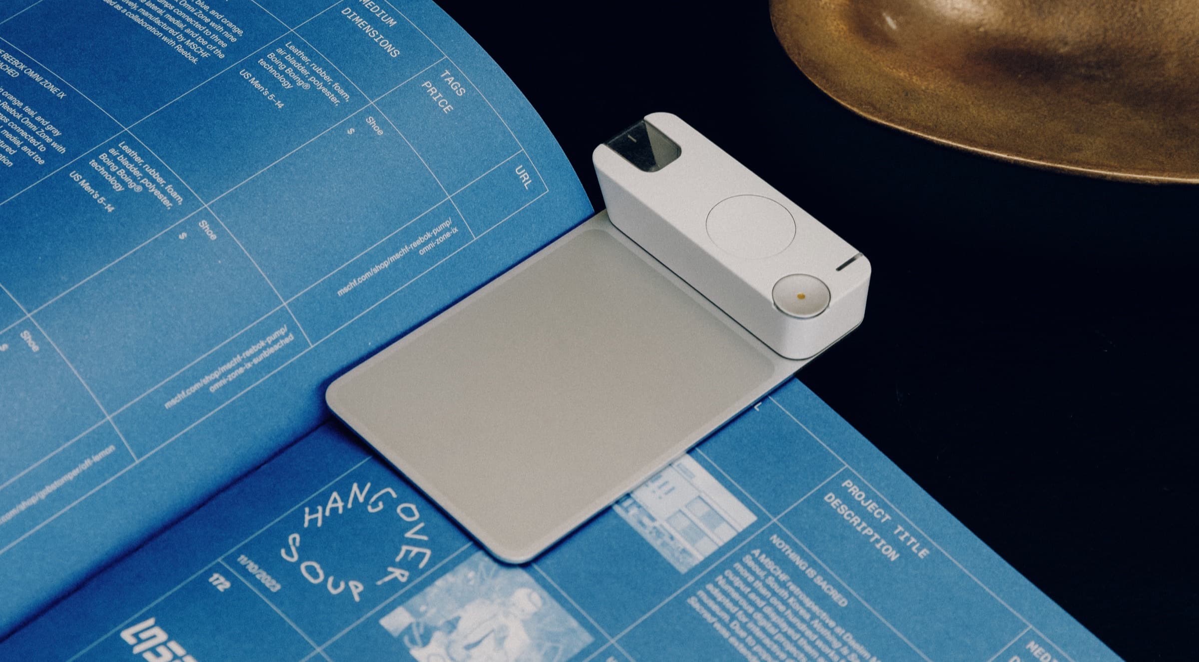
The app and share cards for Mark, a reading companion that turns the lines you underline into something you'd want to post.
- Timeline
- Fall 2025, eight weeks
- Role
- Product designer, TroyLabs BUILD
- Team
- Eason Tang, Charlotte Chang, Rehaan Anjaria, Peter Kreuter, Eric Park, Carter Davis
- Disciplines
- Product Design, UI/UX, Brand, Merchandise, Packaging, Pitch Deck
Setup
Mark is a bookmark and an app that save the lines you underline
Eason Tang built it through TroyLabs' BUILD program, and I joined as one of the first product designers for eight weeks in fall 2025. I explored how the app should hold notes and books, then designed the share cards that carry a line from the page to someone's feed.
The screen that mattered most was the one that leaves the app. A line only brings in new readers if someone is proud to post it.
Mark is at thinkwithmark.com, and TIME named it one of the Best Inventions of 2026.
- $1M+raised
- 2026
- 8,000on the waitlist while I worked on it
Shipped
I designed the app's library and its share cards
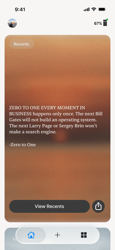
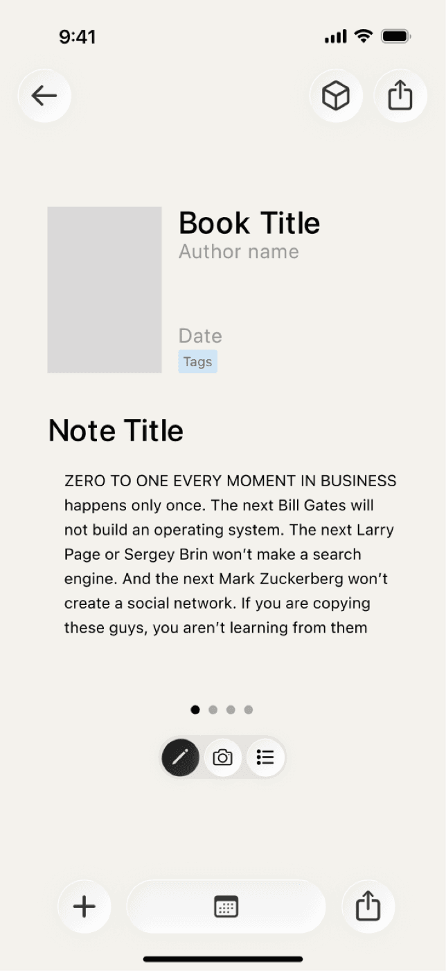
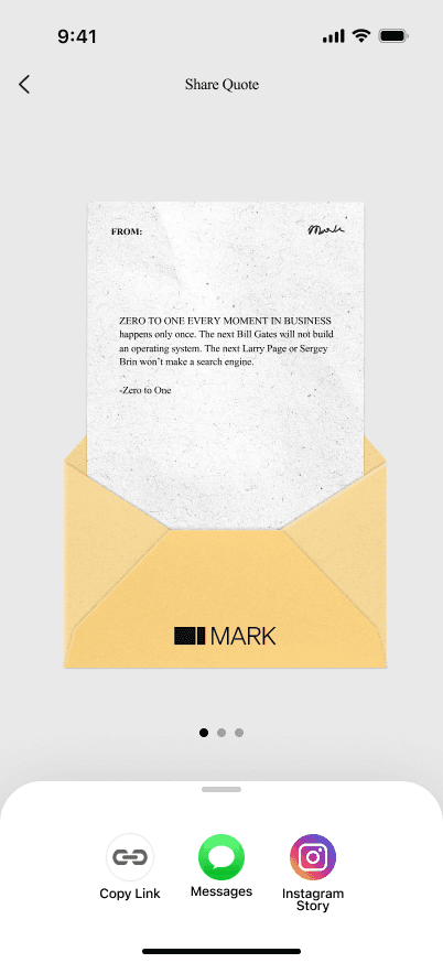
- 01
Library
Every line, findable by book, category or note.
- 02
Note detail
The line next to what you thought about it.
- 03
Share
Pick a style and post.
Problem
Readers needed a reason to come back to their saved lines and to share them
The bookmark already handled saving, and Eason wanted what came after to feel as shareable as Spotify Wrapped.
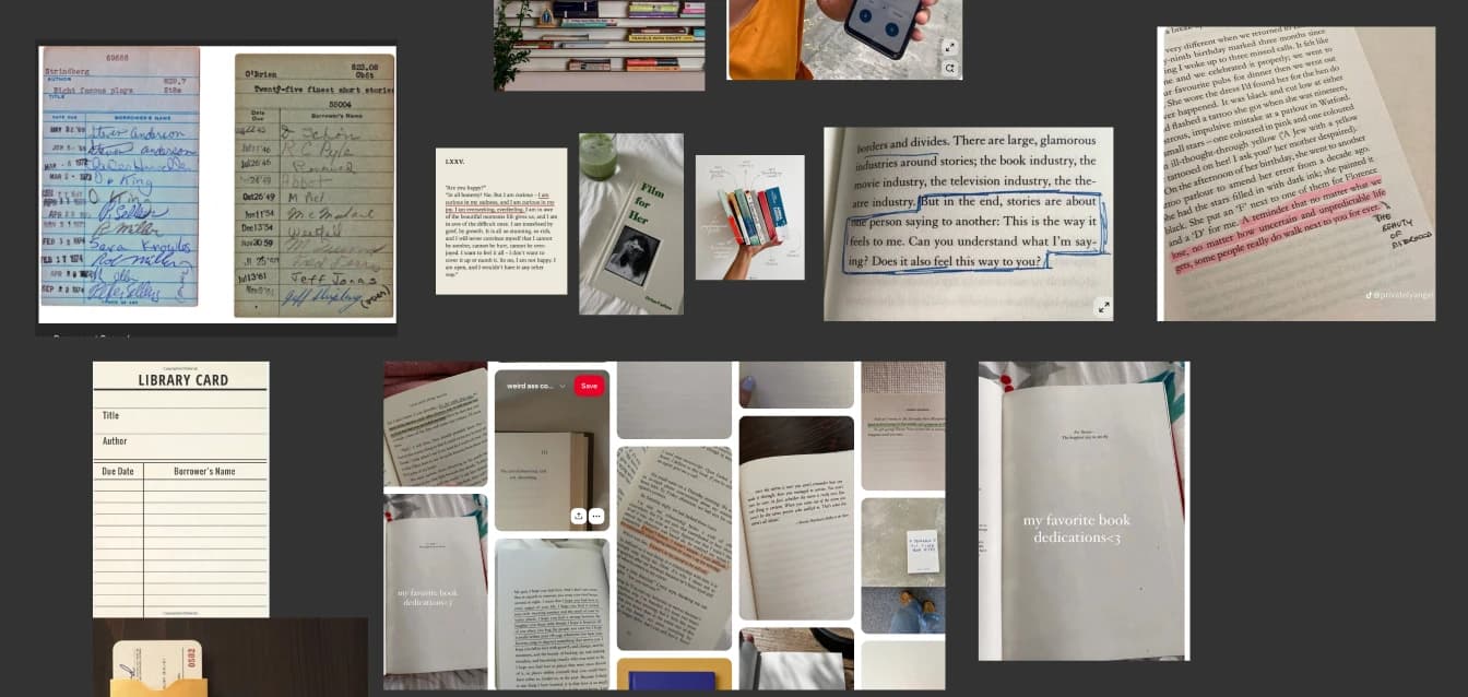
How people kept lines before Mark: a camera roll of underlined pages.
The library · Exploration 1
I first organised the library as a bookshelf, but it was slower to use
Mark holds books, the lines you highlight in them, and the notes you write beside those lines. Books sat on shelves the way they do at home. It was more stylised than anything else in the app, and Eason didn't like it.
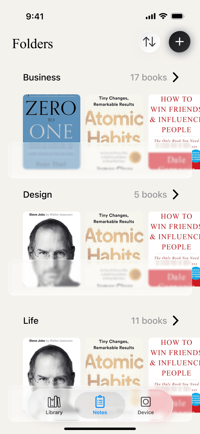
The bookshelf version: each folder is a shelf of covers.
The library · Exploration 2
Next I tried a grid of cards that put the book first
Most of the iterating happened there.
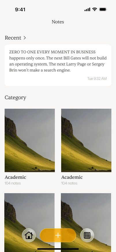

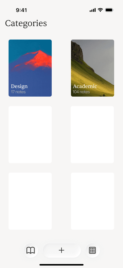
Three of the card structures I tried.
The library · Solution
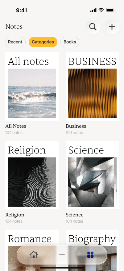
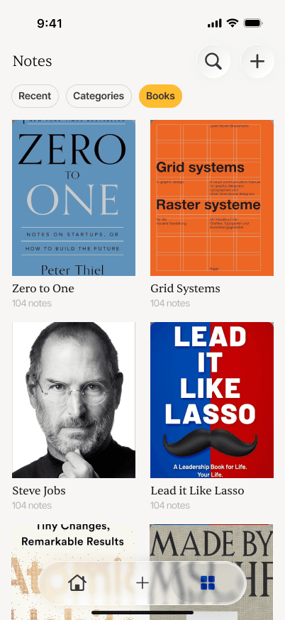
The final library has three tabs: Recent, Categories and Books
Any line can be found by book, by category or by the note written beside it, and every line stays with its note so you remember why it mattered.
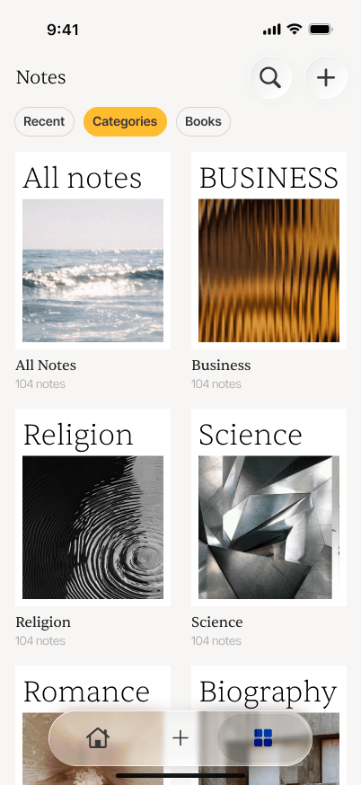
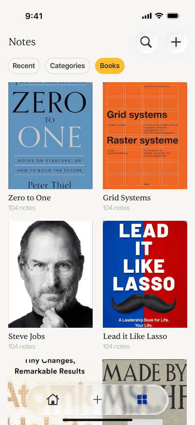
The Categories and Books tabs as they shipped.
What I learned
I couldn't find the right structure on paper. It only became obvious once I put it into action and started designing and building.
The share cards · Exploration 1
For sharing, I started by sketching what a shared line could look like
A quote means very little to someone who hasn't read the book. The sketches covered stats to scroll through and pick from, a library card with a tassel, and a quote card you could edit before posting.
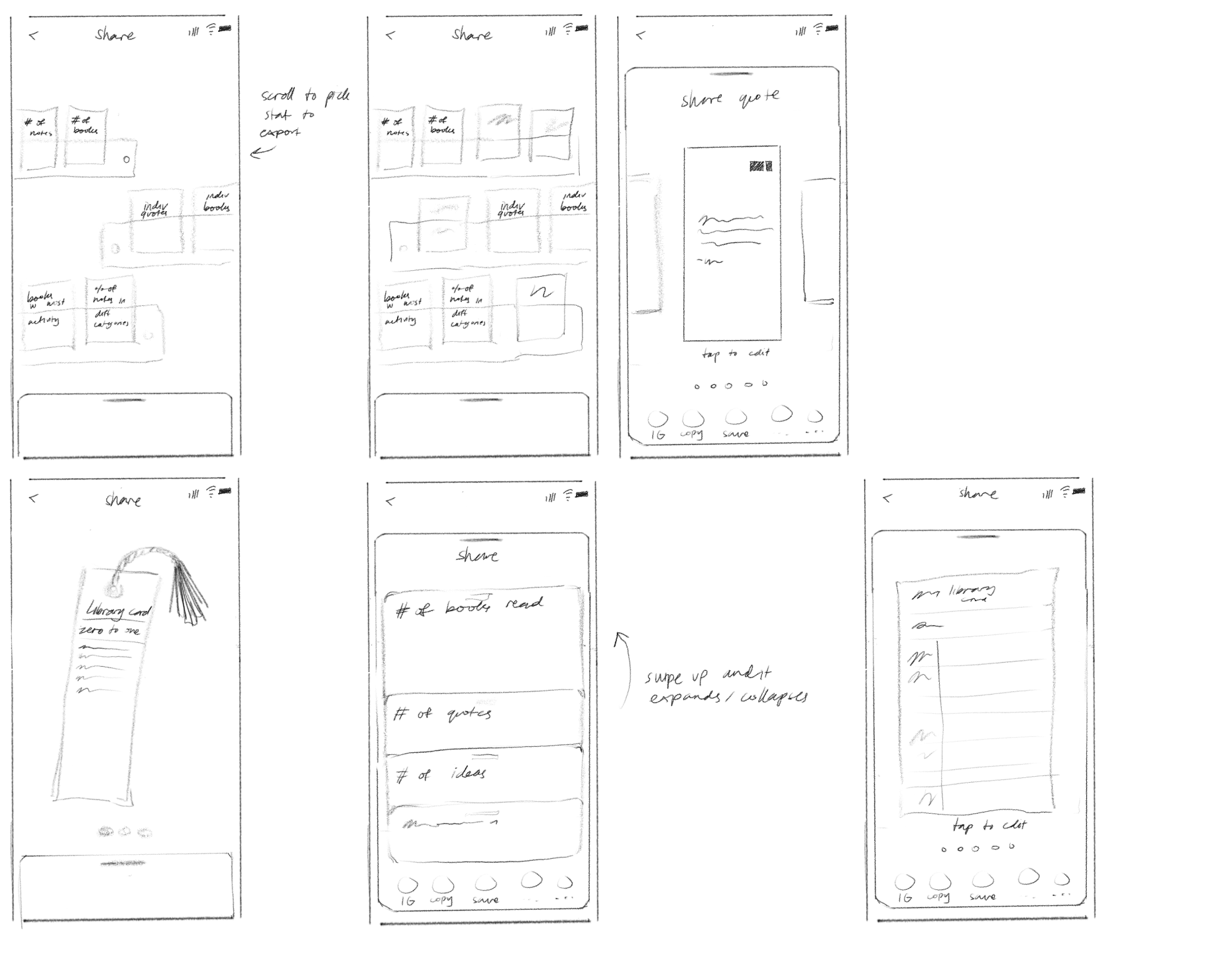
The share sketches: stats to pick from, a library card, and the quote card that became the three styles.
The share cards · Exploration 2
My first share cards were plain, and they were forgettable
The first passes put the quote on plain paper, then on the book's cover.
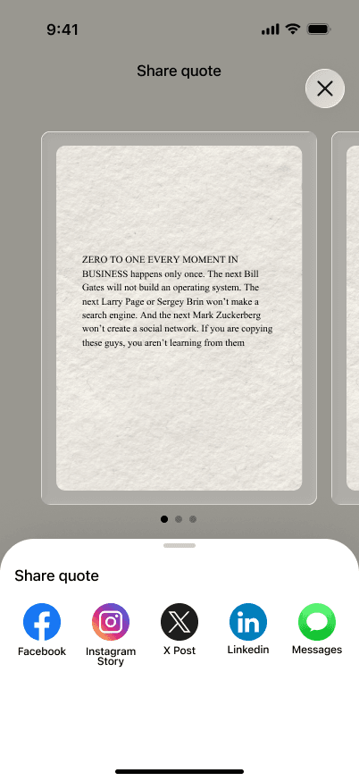
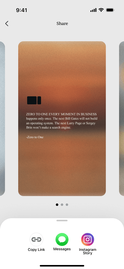
The quote on plain paper, then over the book's cover.
The share cards · Solution
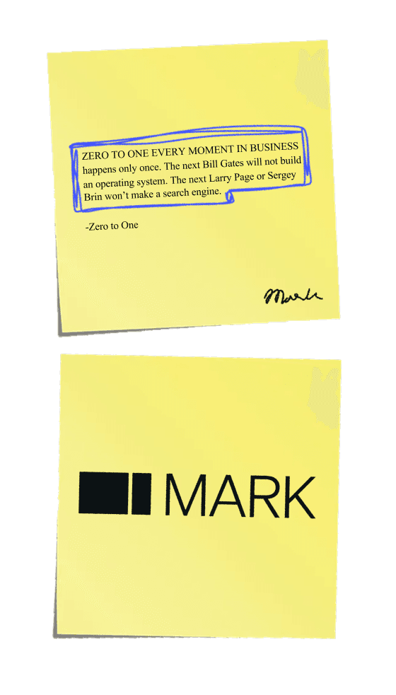
The final share cards come in three bold styles: a letter, a postcard and a sticky note
They're Wrapped-style, one for each way you'd write a thought down. I had fun with this.
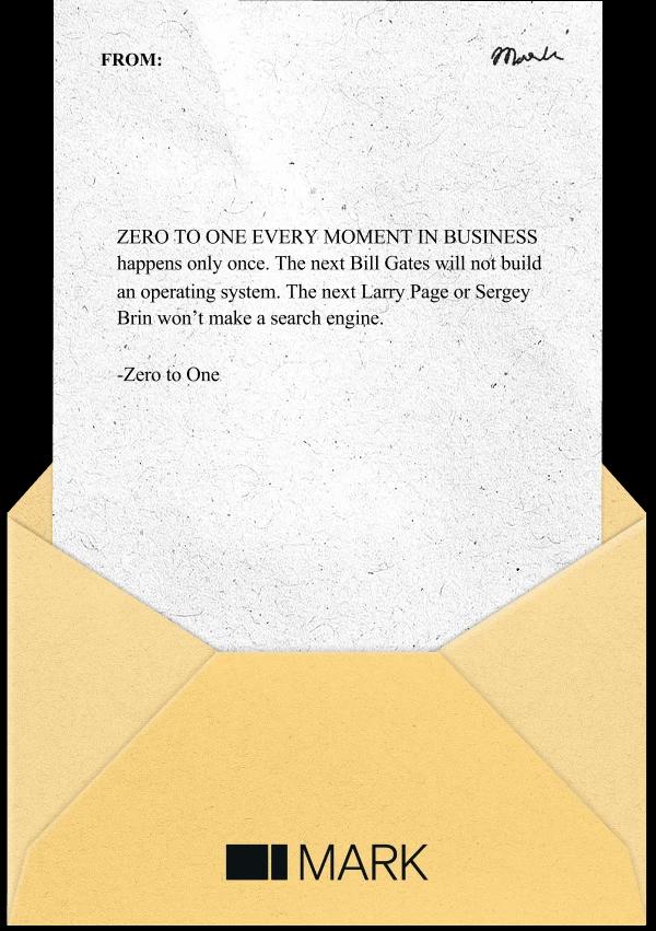
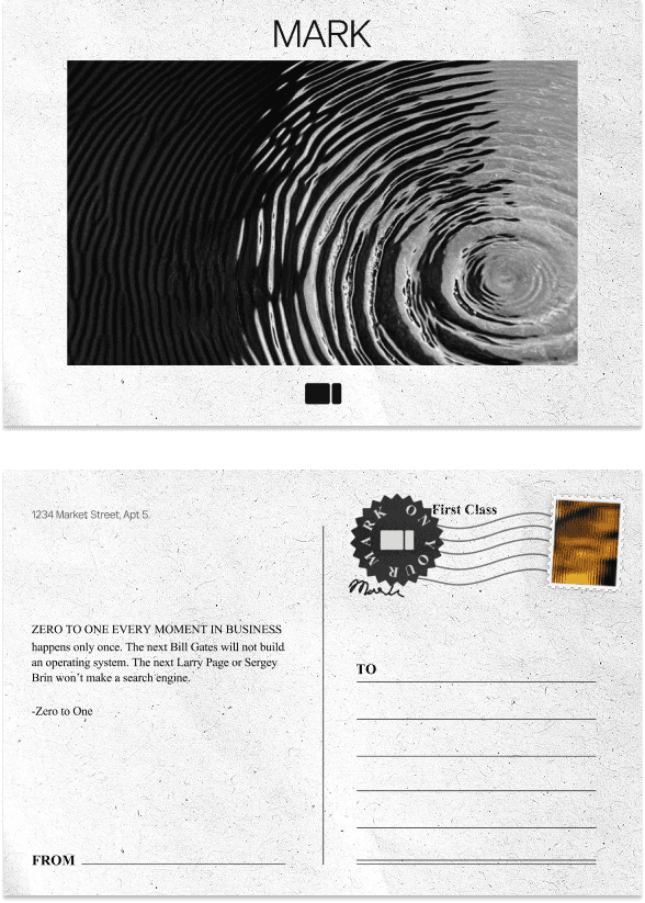

The three that shipped: a letter, a postcard, a sticky note.
What I learned
Restraint isn't always good taste; a card has to be worth being seen with, so personality beat polish.
Around it
I also carried the brand into everything physical.

Packaging
Twenty rough concepts down to three, with yellow chosen last because it carried so much of the identity.

Merch
Stickers, shirts and totes built on the make your mark lines from the cards.
Pitch deck
I turned Mark's idea into the three-minute deck for the LAUNCH summit.
What I learned
I learned that my own reading habits are not every reader's
Putting it in front of people would have let me iterate much faster and reach a final product much sooner.
Next time, I'd spend much more time testing these screens in front of real readers.